Wednesday, April 6, 2011

Top 10 Information Architecture Mistakes

Summary:
Structure and navigation must support each other and integrate with search and across subsites. Complexity, inconsistency, hidden options, and clumsy UI mechanics prevent users from finding what they need.
Bad information architecture causes the majority of outright user failures and isn't improving at the rate of other Web usability issues. To determine why, I've identified 10 long-term sore thumbs that together cost websites billions of dollars each year.
I divided the following list of worst IA mistakes into two parts, which corresponds to how we partition the materials across our 2-day IA course: structure on Day 1 and navigation on Day 2. Of course, you need to get both right, but they're essentially two different design levels: The invisible way the site is structured and the visible way users understand and manage that structure.

Structure Mistakes

1. No Structure

The most notable structural problem is when designers treat a site like one big swamp with no organizing principle for individual items. Yes, users can fish the swamp using search or by following links from current promotions or outside sites. But whatever they dredge up is it. No opportunities for understanding the site's other offerings or locating related items. This sin is common on news sites and catalog-based e-commerce sites, where each item (articles and products, respectively) is treated as a stand-alone unit without connections to related items. No wonder users leave those sites so quickly.

2. Search and Structure Not Integrated

We've long known that users often exhibit search-dominant behaviors. This doesn't mean that search is all they need, however. Arriving on a page from a search is like parachuting into a city. Hopefully, if you want to go to Paris, you'll land there rather than in Amsterdam, but in any case, you're unlikely to land on the doorstep of your favorite restaurant. To get there, you'll need to walk or take a cab. Similarly, users often need to navigate the neighborhood around their search destination. Of course, local navigation works only if the site has a structure to define its neighborhoods (see mistake #1). But the design must also expose local options to users. Even better if it indicates how relevant the neighboring options are to the user's current query.
SERP (search engine results page) usability increases when each search hit exposes its location within the site structure. External search engines like Google can't always do this because they don't know the site's structure or which navigational dimensions are most relevant to common site tasks. But you do know your site's structure and should therefore include the info on your own SERPs.
Sadly, search and navigation fail to support each other on many sites. This problem is exacerbated by another common mistake: navigation designs that don't indicate the user's current location. That is, after users click a search result, they can't determine where they are in the site — as when you're searching for pants and click on a pair, but then have no way to see more pants.

3. Missing Category Landing Pages

We recommend that sites have a series of categories that each link to their own landing page that gives users a section overview. Sometimes, sites forego the overview page and simply offer links directly to individual pages within a section. This might reduce the number of site pages, but when no page is clearly identified as a sub-topic page, users can misunderstand the site's scope and miss important details, products, and services. Category pages also help SEO because they're the most prominent landing place when people search for a type of product, service, or information. They're also a way to overcome mistake #2 because they help users bump up a level or two in the site structure if search takes them to an overly detailed leaf node. (Breadcrumbs facilitate users' ability to easily move up the levels.)

4. Extreme Polyhierarchy

Compared to the physical world, one of the online world's benefits is that items can live in multiple locations. Because websites can classify products and other content along multiple dimensions, they help users navigate locally to related items and provide faceted winnowing of a large product space into manageable shortlists that can satisfy the user's main requirements. This is all good, but polyhierarchy can easily become a crutch. Rather than spend time upfront to develop several intuitive and logical top-level categories, teams rush through this important process, creating numerous weak categories and listing products multiple times within them. The usability impact? Users spend too much time agonizing over top-level categories and then get confused when they see items showing up in multiple places ("are these the same thing?").
With too many classification options and too many structured dimensions, users are forced to think harder to move forward. The profusion of options also makes people question the information scent. This lack of confidence early in the site experience extends throughout their visit and can negatively impact the end result (by thwarting a purchase, for example).

5. Subsites/Microsites Poorly Integrated with Main Site

Abandoned microsites litter the Web as the detritus of old marketing campaigns. A dedicated microsite might have been a good idea back when you launched a new product, but by the next year it's undermining your online strategy and diluting your online presence. Web design is design for the ages. Think about how anything you do will feel in 5 years.
It's typically best to forego independent microsites and place new information on subsites within the main site. But you still need to integrate these subsites within the overall site structure.
For example, on both microsites and subsites, we often see product-specific pages that fail to link to information about the company or organization behind the offering. Further, many sites poorly represent their subsites in the main site search — which often ignores microsites altogether.

Navigation Mistakes

6. Invisible Navigation Options

The very worst mistake might be to have no navigation, but that's so rare that I'm not going to discuss it. Still, any feature that users can't see might as well not exist; invisible navigation is thus nearly as bad as no navigation. Uncovering navigation shouldn't be a major task: Make it permanently visible on the page. Small children like minesweeping (passing the mouse around the screen to see what's hidden), but teenagers don't like it, and adults hate it.
Similarly, you should avoid banner blindness bleed, when either the navigation itself looks like a banner or you place it next to elements that look like advertising and thus users screen it out. Even if it's on the screen, your navigation might as well be invisible if users don't look at it.

7. Uncontrollable Navigation Elements

Typically, anything that moves and bounces detracts from Web usability; when navigation moves while users are trying to find their way, it's deadly. Users should focus on the higher-level problem of where to go, not the lower-level problem of how to manipulate the GUI. Two common offenders here are overly sensitive rollovers that launch and block content, and elements that move, spin, or rotate of their own accord. Users routinely complain about these types of elements. Designers and programmers who include them in websites severely underestimate the business impact of user frustration.

8. Inconsistent Navigation

Navigation exists to help users, not to be a puzzle in its own right. Users should be able to understand it immediately, and apply that understanding throughout the site. Sadly, lots of sites change their navigation features as users move around. Options come and go, making users feel a loss of control. How do I get that menu choice back? I saw it just a few pages ago. Although global navigation is not a site's most popular element, its persistence serves a key purpose: it's a beacon that helps users understand both where they are and how they can easily maneuver back to the top of the site if they lose their way.

9. Too Many Navigation Techniques

Our full-day seminar on navigation design covers 25 different website navigation techniques. Each approach has its own usability advantages and potential downsides, leading to the seminar's focus on design trade-offs — that is, when to use what form of navigation. One thing is clear: each navigation technique has its place on certain types of websites and intranets. But, if you use them all, you don't get the sum of each technique's benefits. You get a mess.
Competing for users' attention. Too many places to look. Overwhelming. Don't.

10. Made-Up Menu Options

In the past, this mistake would have ranked higher, but luckily it's less predominant today than it used to be. Still, too many sites continue to make up their own terminology for labels and other navigation choices. In addition to perplexing users, made-up navigation terms also hurt search; users can't find something if they don't know what it's called. Even if you provide synonyms, the main navigation terms carry extra SEO weight and it's a waste to optimize for a query that nobody will issue.
Old words are better. When users understand their choices, they're more likely to pick the right one. Speak plainly and speak simply. If users don't understand a menu item, they're less likely to click on it. Paradoxically, companies are particularly prone to making up fancy terms for their newest and most important offerings, thus shooting themselves in the foot with a double-barreled rifle.


The Top Ten Design Mistakes

Summary:
Blogs are often too internally focused and ignore key usability issues, making it hard for new readers to understand the site and trust the author.
Blogs are a form of website. The thousands of normal website usability guidelines therefore apply to them, as do this year's top ten design mistakes. But weblogs are also a special genre of website; they have unique characteristics and thus distinct usability problems.
One of a weblog's great benefits is that it essentially frees you from "Web design." You write a paragraph, click a button, and it's posted on the Internet. No need for visual design, page design, interaction design, information architecture, or any programming or server maintenance.
Blogs make having a simple website much easier, and as a result, the number of people who write for the Web has exploded. This is a striking confirmation of the importance of ease of use.
Weblogs' second benefit is that they're a Web-native content genre: they rely on links, and short postings prevail. You don't have to write a full article or conduct original research or reporting. You can simply find something interesting on another site and link to it, possibly with commentary or additional examples. Obviously, this is much easier than running a conventional site, and again indicates the benefits of lowering the barriers to computer use.
As a third benefit, blogs are part of an ecosystem (often called the Blogosphere) that serves as a positive feedback loop: Whatever good postings exist are promoted through links from other sites. More reader/writers see this good stuff, and the very best then get linked to even more. As a result, link frequency follows a Zipf distribution, with disproportionally more links to the best postings.
Some weblogs are really just private diaries intended only for a handful of family members and close friends. Usability guidelines generally don't apply to such sites, because the readers' prior knowledge and motivation are incomparably greater than those of third-party users. When you want to reach new readers who aren't your mother, however, usability becomes important.
Also, while readers of your intranet weblog might know you, usability is important because your readers are on company time. (As an example, see IBM's use of intranet blogs — among the ten best intranets of 2006.)

Usability Issues

To reach new readers and respect your existing readers' time constraints, test your weblog against the following usability problems.

1. No Author Biographies

Unless you're a business blog, you probably don't need a full-fledged "about us" section the way a corporate site does. That said, the basic rationale for "about us" translates directly into the need for an "about me" page on a weblog: users want to know who they're dealing with. It's a simple matter of trust. Anonymous writings have less credence than something that's signed. And, unless a person's extraordinarily famous, it's not enough to simply say that Joe Blogger writes the content. Readers want to know more about Joe. Does he have any credentials or experience in the field he's commenting on? (Even if you don't have formal credentials, readers will trust you more if you're honest about that fact, set forth your informal experience, and explain the reason for your enthusiasm.)

2. No Author Photo

Even weblogs that provide author bios often omit the author photo. A photo is important for two reasons:
  • It offers a more personable impression of the author. You enhance your credibility by the simple fact that you're not trying to hide. Also, users relate more easily to somebody they've seen.
  • It connects the virtual and physical worlds. People who've met you before will recognize your photo, and people who've read your site will recognize you when you meet in person (say, at a conference — or the company cafeteria if you're an intranet blogger).
A huge percentage of the human brain is dedicated to remembering and recognizing faces. For many, faces work better than names. I learned this lesson myself in 1987 when I included my photo in a HyperCard stack I authored that was widely disseminated on Mac-oriented BBSs. Over the next two years, countless people came up to me and said, "I liked your stack," having recognized me from the photo. Also, if you run a professional blog and expect to be quoted in the press, you should follow the recommendations for using the Web for PR and include a selection of high-resolution photos that photo editors can download.

3. Nondescript Posting Titles

Sadly, even though weblogs are native to the Web, authors rarely follow the guidelines for writing for the Web in terms of making content scannable. This applies to a posting's body text, but it's even more important with headlines. Users must be able to grasp the gist of an article by reading its headline. Avoid cute or humorous headlines that make no sense out of context. Your posting's title is microcontent and you should treat it as a writing project in its own right. On a value-per-word basis, headline writing is the most important writing you do.
Descriptive headlines are especially important for representing your weblog in search engines, newsfeeds (RSS), and other external environments. In those contexts, users often see only the headline and use it to determine whether to click into the full posting. Even if users see a short abstract along with the headline (as with most search engines), user testing shows that people often read only the headline. In fact, people often read only the first three or four words of a headline when scanning a list of possible places to go. Sample bad headlines:
  • What Is It That You Want?
  • Hey, kids! Comics!
  • Victims Abandoned
Sample good headlines:
  • Pictures from Die Hunns and Black Halos show
  • Office Depot Pays United States $4.75 Million to Resolve False Claims Act Allegations
    (too long, but even if you only read the first few words, you have an idea of what it's about)
  • Ice cream trucks as church marketing
This last headline works on a church-related blog. If you're writing an ice cream industry blog, start the headline with the word "church" because it's the information-carrying word within a context of all ice cream, all the time. In browsing weblog headline listings to extract these examples, I noticed several headlines in ALL CAPS. That's always bad. Reading speed is reduced by 10% and users are put off by the appearance of shouting.

4. Links Don't Say Where They Go

Many weblog authors seem to think it's cool to write link anchors like: "some people think" or "there's more here and here." Remember one of the basics of the Web: Life is too short to click on an unknown. Tell people where they're going and what they'll find at the other end of the link. Generally, you should provide predictive information in either the anchor text itself or the immediately surrounding words. You can also use link titles for supplementary information that doesn't fit with your content. (To see a link title in action, mouse over the "link titles" link.)
A related mistake in this category is to use insider shorthand, such as using first names when you reference other writers or weblogs. Unless you're writing only for your friends, don't alienate new visitors by appearing to be part of a closed clique. The Web is not high school.

5. Classic Hits are Buried

Hopefully, you'll write some pieces with lasting value for readers outside your fan base. Don't relegate such classics to the archives, where people can only find something if they know you posted it, say, in May 2003. Highlight a few evergreens in your navigation system and link directly to them. For example, my own list of almost 300 Alertbox columns starts by saying, "Read these first: Usability 101 and Top Ten Mistakes of Web Design."
Also, remember to link to your past pieces in newer postings. Don't assume that readers have been with you from the beginning; give them background and context in case they want to read more about your ideas.

6. The Calendar is the Only Navigation

A timeline is rarely the best information architecture, yet it's the default way to navigate weblogs. Most weblog software provides a way to categorize postings so users can easily get a list of all postings on a certain topic. Do use categorization, but avoid the common mistake of tagging a posting with almost all of your categories. Be selective. Decide on a few places where a posting most belongs. Categories must be sufficiently detailed to lead users to a thoroughly winnowed list of postings. At the same time, they shouldn't be so detailed that users face a category menu that's overly long and difficult to scan. Ten to twenty categories are appropriate for structuring many topics.
On the main page for each category, highlight that category's evergreens as well as a time line of its most recent postings.

7. Irregular Publishing Frequency

Establishing and meeting user expectations is one of the fundamental principles of Web usability. For a weblog, users must be able to anticipate when and how often updates will occur. For most weblogs, daily updates are probably best, but weekly or even monthly updates might work as well, depending on your topic. In either case, pick a publication schedule and stick to it. If you usually post daily but sometimes let months go by without new content, you'll lose many of your loyal — and thus most valuable — readers.
Certainly, you shouldn't post when you have nothing to say. Polluting cyberspace with excess information is a sin. To ensure regular publishing, hold back some ideas and post them when you hit a dry spell.

8. Mixing Topics

If you publish on many different topics, you're less likely to attract a loyal audience of high-value users. Busy people might visit a blog to read an entry about a topic that interests them. They're unlikely to return, however, if their target topic appears only sporadically among a massive range of postings on other topics. The only people who read everything are those with too much time on their hands (a low-value demographic). The more focused your content, the more focused your readers. That, again, makes you more influential within your niche. Specialized sites rule the Web, so aim tightly. This is especially important if you're in the business-to-business (B2B) sector.
If you have the urge to speak out on, say, both American foreign policy and the business strategy of Internet telephony, establish two blogs. You can always interlink them when appropriate.

9. Forgetting That You Write for Your Future Boss

Whenever you post anything to the Internet — whether on a weblog, in a discussion group, or even in an email — think about how it will look to a hiring manager in ten years. Once stuff's out, it's archived, cached, and indexed in many services that you might never be aware of. Years from now, someone might consider hiring you for a plum job and take the precaution of 'nooping you first. (Just taking a stab at what's next after Google. Rest assured: there will be some super-snooper service that'll dredge up anything about you that's ever been bitified.) What will they find in terms of naïvely puerile "analysis" or offendingly nasty flames published under your name?
Think twice before posting. If you don't want your future boss to read it, don't post.

10. Having a Domain Name Owned by a Weblog Service

Having a weblog address ending in blogspot.com, typepad.com, etc. will soon be the equivalent of having an @aol.com email address or a Geocities website: the mark of a naïve beginner who shouldn't be taken too seriously. Letting somebody else own your name means that they own your destiny on the Internet. They can degrade the service quality as much as they want. They can increase the price as much as they want. They can add atop your content as many pop-ups, blinking banners, or other user-repelling advertising techniques as they want. They can promote your competitor's offers on your pages. Yes, you can walk, but at the cost of your loyal readers, links you've attracted from other sites, and your search engine ranking.
The longer you stay at someone else's domain name, the higher the cost of going independent. Yes, it's tempting to start a new weblog on one of the services that offer free accounts. It's easy, it's quick, and it's obviously cheap. But it only costs $8 per year to get your personal domain name and own your own future. As soon as you realize you're serious about blogging, move it away from a domain name that's controlled by somebody else. The longer you delay, the more pain you'll feel when you finally make the move.

Thursday, March 24, 2011

Post-CSUN Resources

My last podcast previewed CSUN (The 26th Annual International Technology & Persons with Disabilities Conference), which happened last week. It was a great success. Fortunately a few folks have written great summaries of the event, listed below. Also, I've posted some CSUN11 photos on Flickr.
CSUN logo
Here are two excellent resources for session presentations and more:
  • The Great Big List from the 2011 CSUN Conference by Curb Cut.
  • CSUN 2011 Web highlights by Leonie Watson.
A couple notable blog posts:
  • My March Madness - John Foliot.
  • Lightening Talk on Accessible Twitter updates at CSUN Tweetup - Dennis Lembree.
Suggested presentations relating to web accessibility are:
  • Accessibility of HTML5 and Rich Internet Applications (WebAIM and The Paciello Group): ARIA Morning Session | ARIA Afternoon Session
  • Accessible HTML5 media players, captions, audio description and search (PDF) - Terrill Thompson.
  • Making rich internet applications accessible through jQuery (PDF) - Chris Blouch (AOL) and Hans Hillen (TPG)
  • Using the barcamp/unconference format - Jennison Asuncion, James Timony and John F Croston.
  • Improving Web Accessibility for the Elderly - Roger Hudson.
  • DISTCHA: an attempt to kill CAPTCHA - Vincent François & Samuel Sirois.
Any more to add? Please comment!

Additions

  • Successfully Integrating Accessibility in your Organization's Web Development Lifecycle - Denis Boudreau

Monday, March 14, 2011

Speech from AFB Awards

Last month, Web Axe announced that Accessible Twitter was presented with the American Foundation for the Blind (AFB) 2011 Access Award. I attended the AFB Awards Ceremony last Friday at the JLTLI conference in downtown Seattle, Washington (Web Axe is sister site of Accessible Twitter). Afterwards, I had the honor of dining with the President and CEO of the AFB, Carl R. Augusto. I met several other AFB folks who were all wonderful people.

Here is the acceptance speech I prepared (and closely presented) at the award ceremony.
Thank you so much. I'm deeply honored and very thankful to be here.

A little over 2 years ago, which like 20 years in web technology time, Gez Lemon, on his blog Juicy Studio, wrote about a clever script he developed to correct Twitter.com's lack of keyboard focus.

I wrote a tweet about it and about another accessibility issue on the Twitter website, and a friend and former co-worker Doug Diego suggested I use the Twitter API and create an accessible version. My wife and kids were away visiting family at the time, so it was a great opportunity. And that's what I did. Just a few weeks later, "Accessible Twitter" was born.

I emailed a few peers about the site, and before I even officially announced it, people were offering suggestions, blogging about it, and even better, offering to test it for me.

This anecdote illustrates the power and the cohesiveness of Twitter, and even more so, the accessibility community. And it's a worldwide community. It's the people themselves who make it work, and strive to make it work better. Some of those people are:
  • Matthew Smith (a.k.a. Smiffy) from Australia, who had suggestions for the user interface and helped with coding issues.
  • Steve Faulkner, outside of London, for special code called ARIA which help screen readers interpret certain kinds of content.
  • Kerstin Probiesch and Per Busch, both of Germany, who helped with early testing.
  • Jennison Asuncion, of Toronto, Canada, who continues to be one of the most active users of Accessible Twitter; he provides feedback and helps promote the application.
  • Everett Zufelt, who's also from Canada, with recently suggesting a new method for hiding special content for screen reader users.
So the takeaway here is that the Accessible Twitter project, like many others on the web and elsewhere, is a collaborative effort. My name and my company's name, Web Overhauls, are listed as the authors of the application, but in reality, it's the community that makes it all happen. Thank you.

Monday, March 7, 2011

Accessible YouTube & HTML5 Video

YouTube is obviously a great site for video, but not for everyone as it contains various accessibility challenges, particularly keyboard access. The use of Flash itself to play the video can be problematic, not be mention requiring support of the Flash plugin. HTML5 is a pending solution (HTML5 video is available on YouTube as a "trial"), but in its infancy, HTML5 video has accessibility issues that still need to be resolved, as does HTML5 itself.

In the meantime, here are a few alternatives to the YouTube website which provide more accessible controls and a much cleaner interface.
  • Easy YouTube - by Chris Heilmann.
  • Your Tube - Accessible YouTube - by Dylan Neale, in joint venture with Povidi.com.
  • Accessible Interface to YouTube - by Tom at majestyc.net.
If you still don't have what you need or want, why not build your own interface?! The following are tools and resources for building more accessible YouTube videos including captioning:
  • Accessible YouTube player controls
  • Keyboard controlled YouTube player
  • Captioning YouTube Video and Providing Accessible Controls
  • Easy YouTube caption creator (Accessify)
  • Captions and Subtitles (YouTube)
Further reading:
  • Accessible HTML5 Video with JW Player as Fallback
  • YouTube and the Push to Improve Tech for Disabled
  • Flash and the HTML5 video tag (YouTube API Blog)
  • 10 YouYube URL Tricks You Should Know
If you developed an accessible YouTube solution, or know of another not listed, please leave a comment.

YouTube logo

Thursday, February 24, 2011

Fixing Alt - 6 Reasons Bacon Is Better Than True Love

This is the next blog in a series titled "Fixing Alt" where I supply alternative text to graphics on the web that badly need it (cartoons and infographics).
The Oatmeal has great comics, but badly needs alt text. One of their most successful comics is 6 Reasons Bacon Is Better Than True Love (you can even order a poster) and deserves to be enjoyed by everyone! So here is the text version:

6 Reasons Bacon Is Better Than True Love

Illustration: 3 strips of bacon, greater-than symbol, heart.
  1. True love happens once in a lifetime. Bacon can happen seven times a day, if you want it to. Illustration: Man, drooling, with bacon in hand says "You are my everything".
  2. Bacon you can keep in the fridge. True love you cannot. Illustration: Woman trying to get out of fridge says "Oh God oh God, let me out of here! Man holds door back with heart in a thought cloud.
  3. Love is fleeting, but bacon stays in your arteries for all eternity. Illustration: Man laying down with bacon strips falling in his open mouth.
  4. It will always be there for you. Illustration: Man with tears in eyes says "nobody loves me except my bacon".
  5. Bacon won't divorce you over a little misunderstanding. Illustration: Wife gasping; man in skimpy underwear with goat on leash and 2 nearly naked women says "This isn't what it looks like. These aren't hookers, they are my 'consultants'".
  6. Bacon does not nag or complain. Illustration: Woman says "You've been sitting in that goddamn chair for 8 weeks, go mow the lawn! Soiled man in lounge chair says "Shut up, more bacon please".

Friday, February 18, 2011

Disney & Other Recent Web Accessibility Lawsuits

It's unfortunate that soon after Disney Parks & Resorts receives an award for accessibility from the AFB, an announcement is made for a Class Action Lawsuit Against Disney Alleges Inaccessible Websites. The lawsuit cites Disney's failure to accommodate blind persons in violation of ADA. Read more in this article by Nic Steenhout (@vavroom): Lawsuit Against Disney For Lack Of Accessibility.
Here are more headlines involving law and accessibility over the last few months, mostly web accessibility:
  • Delta hit with $2M DOT disabilities violations fine (February 2011)
  • Scarborough woman wins accessibility challenge against federal government (December 2010)
  • Accessibility Lawsuit Filed Against JetBlue Airways - Law Office of Lainey Feingold (October 2010)
  • Court orders Ottawa to make websites accessible to blind - The Globe and Mail (November 2010)
  • NFB files complaints against 9 law schools for inaccessible web site (May 2010)
  • Unfriendly Skies? Blind Passengers Sue United : NPR (October 2010)
  • NFB files complaint against Penn State University for accessibility problems (November 2010)
  • Blind MBA to have her day in court over inaccessible government websites (September 2010)
  • Blind Students Sue Law Schools Over Online Applications - Wired Campus - The Chronicle of Higher Education, Wired Campus - The Chronicle of Higher Education (June 2010)

Wednesday, February 16, 2011

Accessible Twitter Receives AFB 2011 Access Award

Accessible Twitter blue bird icon Congratulations to Accessible Twitter which has been honored with the American Foundation for the Blind (AFB) 2011 Access Award. Other recipients are CBS, Lexmark, and Walt Disney Parks & Resorts.
An Access Awards Ceremony will be held Friday, March 11, at the 2011 Josephine L. Taylor Leadership Institute (JLTLI) conference in downtown Seattle, Washington.
Accessible Twitter is a web application which serves as an alternative to the Twitter.com website. It is designed to be easier to use and is optimized for disabled users. In addition to all modern desktop browsers (and IE 6), Accessible Twitter runs on virtually any user-agent such as Lynx (text browser), screen readers, the Kindle, Braille displays, and web-enabled mobile devices.

Sunday, February 13, 2011

Music About Web Accessibility!

Here's a great list of music about web accessibility! Includes the premiere of the full Web Axe theme song.
  • WCAG 2.0 Theme Song by David MacDonald (YouTube).
  • Assistive Technology Boogie - fun, and it's accessible Flash! (direct Flash link)
  • "Man With Small F" (The Inaccessible PDF Song) by Terrill Thompson. Listen at end of Web Axe Podcast 77 (Interview with Terrill Thompson) or from Terrill's album Flavors.
  • inaccessible song by Daniel Davis.
  • Listen to the Web Axe theme song! (MP3) composed by my good friend Jeff Ensign.
Anyone have a song to add?!

Monday, February 7, 2011

Podcast #89: CSUN 2011 Preview

Dennis and special guests Jennison Asuncion (@Jennison) and Jared Smith (@jared_w_smith) discuss the upcoming CSUN conference in San Diego, California, at the Manchester Grand Hyatt Hotel, March 14-19, 2011. The official title and website is: 26th Annual International Technology & Persons with Disabilities Conference.
NOTE: Apologies for the poor quality. (But the content is outstanding!)
Download Web Axe Episode 89 (CSUN 2011 Preview)
Transcript of podcast 89
Jennison presenting:
  • Building IT Accessibility Awareness and Community Using the Barcamp/Unconference Format. Wednesday, 9:20.
  • Do We Need to Change the Web Accessibility Game Plan? Panel with John Foliot, Sandi Wassmer, and Jennison. Thursday, 3:10.
Jared presenting:
  • HTML5/ARIA pre-conference workshop w/ Steven Faulkner and Hans Hillen of TPG. All day Tuesday.
  • Screen Reader Web Accessibility Face-off. Wednesday, 3:10.
  • Do We Need to Change the Web Accessibility Game Plan? Panel with John Foliot, Sandi Wassmer, and Jennison. Thursday, 3:10.
  • WebAIM's Screen Reader User Surveys: Data and Trends. Friday, 8am.
  • Preview of WAVE 5 on Friday, 10:40.
More info:
  • There is a (now annual) CSUN Tweet-up Thursday at 6pm. Lightning talks, food, and fun! (Contact Jared if you want to sponsor.)
  • The Twitter hash tag for the event is "#CSUN11".
  • Exhibit Hall-Only entry will be free once again.
  • CSUN On Lanyrd
  • CSUN11 on LinkedIn
  • CSUN11 on Facebook
  • Saturday morning: Dennis on a panel of judges (Sat morn) for the SS12 Code-A-Thon finals!
  • Register for CSUN11

Thursday, February 3, 2011

About Cognitive Accessibility & Related Articles

Cognitive accessibility is closely tied to WCAG 2.0 Principle 3: Understandable which states that "Information and the operation of user interface must be understandable". (WebAIM does a great job in explaining what Cognitive Disabilities actually are.) The guidelines under this principle are:

  • Guideline 3.1 Readable: Make text content readable and understandable.
  • Guideline 3.2 Predictable: Make Web pages appear and operate in predictable ways.
  • Guideline 3.3 Input Assistance: Help users avoid and correct mistakes.

There's been an increase in articles about cognitive accessibility which is great because it's the most difficult and typically least discussed. Here's a great list of them below. Feel free to comment with any that were missed.

Wednesday, January 26, 2011

Fixing Alt - Social Media Definition by Peeing

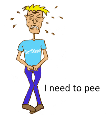
Social Media Definition by Peeing by Mindjumpers is a pretty funny cartoon. Like most, unfortunately, there is no alternative text provided. So in the second of the "Fixing Alt" series, I've taken the liberty of providing it. The cartoon is one large graphic with multiple images. Here's the alt text, with each image in a bullet point:
  • Man in Twitter t-shirt, holding crotch, face strained: "I need to pee."
  • Man in Facebook t-shirt, hands on hips, pee on floor: "I just peed."
  • Man in Foursquare t-shirt pointing at pee on floor: "I'm peeing here."
  • Man in Slideshare t-shirt, arms raised: "Why I am Great at Peeing."
  • Man in Delicious t-shirt with arms crossed: "I collect my pee."
  • Man in YouTube t-shirt, holding and pointing to cup of pee: "Watch this pee!"
  • Man in LinkedIn t-shirt peeing into cup on floor: "I pee well."
  • Man in Digg t-shirt, kneeling to 4 cups of pee: "I digg my pee."
  • Man2 in StumbleUpon t-shirt, man slipping in his pee: "Ups! Discover my pee"
  • Man in Quora t-shirt, scratching chin: "Why am I peeing?"
  • Man in Wikipedia t-shirt, man2 in Wiki t-shirt, woman with pants off, all with arms raised: "Together, we pee-dia!"
Created by MindJumpers.com

Man in Twitter t-shirt, holding crotch, face strained, saying 'I need to pee'.

Monday, January 24, 2011

Even More Web Accessibility Jobs

Great to list even more accessibility jobs!

Web Accessibility Specialist at Modis in Wilmington, DE (long-term contract). Modis is seeking aWeb Accessibility Specialistfor a long term contract position with their industry leading client.The Accessibility Specialist will be responsible for identifying and suggesting potential solutions for accessibility violations based on W3C WCAG 2.0 standards.

Web Accessibility Specialist at DeVry University, Wood Dale, Illinois. The primary purpose of this position is to consult with course developers on the guidelines and application of web accessibility to online courses created in Kinect. This includes researching section 508 and determining enhancements needed to course structure and media.

Accessibility Product Manager at RIM (BlackBerry) in Canada (Waterloo, Toronto, Ottawa). The Accessibility team is responsible for ensuring BlackBerry products and services are usable and accessible by the widest possible audience. This includes researching, specifying, designing and driving through to implementation various internal and external accessibility solutions. The successful candidate will be the voice of the customer and responsible for driving, from concept to implementation, emergency access BlackBerry solutions that meet the needs of persons with disabilities, wireless carrier partners and applicable legislation.

Accessibility Practice Lead, Atlanta, GA, 6-month contract. Collaborate with the User Experience and Development teams in planning, documenting and testing usable accessibility compliant interfaces. Proactively determine process, efficiencies, patterns, training and communication opportunities to improve our online experience for all users. Present and conduct training sessions for various teams on web accessibility process, planning, documentation and testing. Complete audits and test current and new products for compliance. Draft and maintain standards documents and remain abreast of trends and developments in the area of web and software accessibility.

Sunday, January 23, 2011

Podcast #88: Quick Start to 2011

Dennis and Ross discuss the goings on in the Web Axe world, a few good articles, and a few upcoming conferences.

Download Web Axe Episode 88 (Quick Start to 2011)

Transcript of podcast 88

What's New

Articles

Conferences

Wednesday, January 19, 2011

25 Ways To Make Your Website Accessible

After a long delay, a comprehensive how-to article on web accessibility by Web Axe creator Dennis Lembree is finally published: 25 Ways To Make Your Website Accessible. (The Shortened URL is http://weba.im/25axs) Each method listed includes a succinct explanation and also an image to help convey the point. The points are:

  1. Consistent Layout and Structure
  2. Add Alternative Text to Images
  3. Use Page Headings
  4. Use Headings Properly
  5. Skip Links
  6. Link Content
  7. Link Awareness
  8. Be Careful With Title Attribute
  9. Keep the Underline
  10. Forms
  11. Make All Links Accessible to Keyboard
  12. Show Link Focus
  13. Add ARIA Landmark Roles
  14. Validate Mark-Up
  15. The Three Tiers, and Progressive Enhancement
  16. Use List Elements for Lists
  17. Use More Than Color to Convey Meaning
  18. [Sufficient] Color Contrast
  19. Mark Up Data Tables Correctly
  20. Make Changes to Content Clear
  21. Now, About That Flash…
  22. Provide Transcriptions
  23. Add Captions
  24. Appropriate Language
  25. Test Through Multiple Methods

Thursday, January 13, 2011

Free Online Books on Accessibility

Tweets were recently going around about free online/e-books relating to web accessibility. They point to the web page 6 free online books about web accessibility by Jitendra. I've repeated them here in a simple list and added a Microsoft book and an excerpted chapter by Shawn Lawton Henry from one of the books.

Cover of book Web Accessibility: Web Standards and Regulatory Compliance

Sunday, January 9, 2011

Comments on A quick Web Accessibility Checklist

I came across the article A quick Web Accessibility Checklist (published last July) and have some feedback. Some points were great, but others needed some work. I was going to leave a comment, but thought the points would be good to share in a blog post.
  • "Skip-to" links help, but wouldn't put first on the list. Proper tag markup and ARIA are also big navigation helpers.
  • Font resize widgets are unnecessary as they add weight to a site, add clutter to the screen, and the behavior should be done by the browser.
  • A site map is not needed if navigation is done well and is accessible; the tip is more of a usability issue in my opinion.
  • Don't know what "links have descriptive screen text" means. If it means tool-tips (title attribute), then I highly recommend not doing most of the time.
  • Yes, keyboard accessible dropdown menus are good, but remember that the whole site must be keyboard accessible.
  • People still use frames? iFrames also relevant to list here, and more up-to-date.
  • A good basic point missing is color; ensure sufficient color contrast, no content conveyed with color alone; etc.

Update, Jan 11:

I submitted a blog comment that linked to this page, and it did not yet get accepted.

Shortened URL to this page: http://weba.im/commquick

Saturday, January 1, 2011

Intro to Web Accessibility Resources

For the new year, I thought it would be a good time to list some solid introductory Web Accessibility Resources.

Addendum:

And now there's this by Web Axe host Dennis Lembree! 25 Ways To Make Your Website Accessible